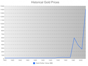
Here is the chart that I put together using the historical data of gold.
Using raw data was a bit of a challenge because the value of gold did not change much until the later part of the 1900s. I only used data for every ten years starting in the year 1800. It was interesting to see that the value of gold did not change much for almost 130 years. In the late 1900s gold really started to become more valuable. I ran into problems trying to make the years in increments of ten. I was not able to to represent every ten years as I wanted but you can see the change in the line every ten years. I could have added more data points to depict more change in the line because in every year after the 1930s the price of gold changed. I wanted to show how dramatic gold’s value has changed in the last 30 years compared to the last 200 years.

