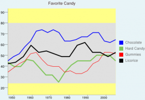
Here is the chart that I created.
chart.googleapis.com/chart?chf=a,s,000000|bg,s,E8F4F7|c,s,FFFF88&chxr=0,13.333,93.333|1,1946.667,2005.333&chxs=0,000000,9.833,1,lt,000000|1,000000,9.167,0.667,lt,000000&chxtc=0,10&chxt=y,x&chs=434×300&cht=lc&chco=0000FF,80C65A,FF0000,000000&chd=s:Ybdimtususmmnppssmln,XUUZYTOOJQVYYYcccY,QTWYdeZVUUQRPPRWYeed,WXbjefdbbjleebe&chdl=Chocolate|Hard+Candy|Gummies|Licorice&chls=2,10,0|3,10,0|1.1,19,0|2.667,7,0&chma=|10,2&chm=r,E0E0E0,0,0.133,0.833&chtt=Favorite+Candy&chts=3E2222,11.5
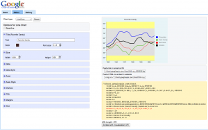
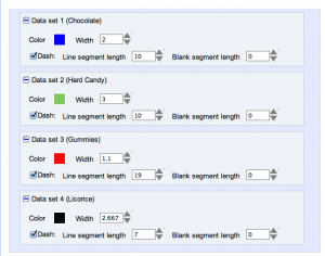
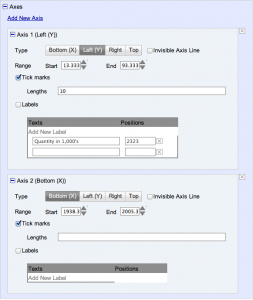
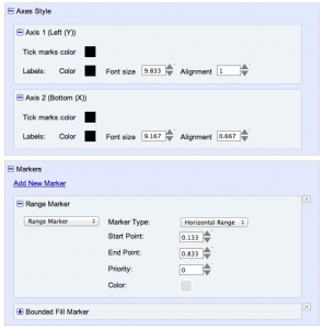
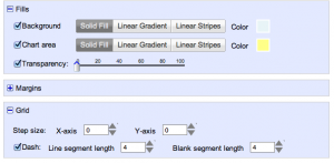
So creating this chart was a lot of fun. I tried to make it as complicated as possible to make use of as many tools as possible. I tried switching through the different types of charts but with the information that I plugged in the bar graph was not working too well. The information that was provided is not accurate. Here is what it looked like when I was putting it together.
The hardest process of putting together this chart together was figuring out what information I wanted to display.

